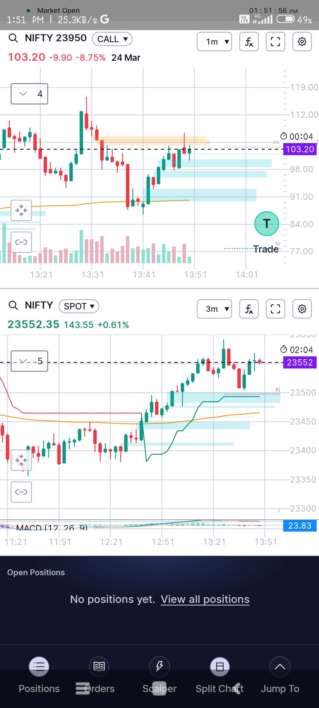
There is a UI issue in the app where the bottom navigation menu is overlapping with the main content area.
Specifically, the "Open Positions" section and related content are getting partially hidden behind the bottom navigation bar. This affects visibility and usability, as important information is not fully accessible.
Request you to please look into this and adjust the layout (padding/margin or safe area) so that the content is properly visible above the navigation menu across all screen sizes.
Attached screenshot for reference.